
Ideas & Designs for In-App Messaging
In-App messages enhance user engagement by triggering timely, relevant content directly within the app. They improve user experience by providing personalized offers, updates, and support without disrupting the app flow.
Let’s look at some cases using In-Apps and creating messages in Reteno.
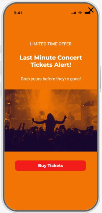
Limited Offers and Essential Updates
In-app messages deliver limited offers, updates, and alerts directly to users, ensuring timely and relevant communication. This boosts engagement and keeps users informed without disrupting their app experience.
Tips
- Timing is Key: Send messages at optimal times when users are most likely to engage. Our key takeaways on managing In-App campaigns will help you grab users' attention in the best aha moment.
- Clear Call to Action: Ensure every message has a clear and compelling call to action.
- Test and Iterate: Continuously test different messages and formats to see what works best.
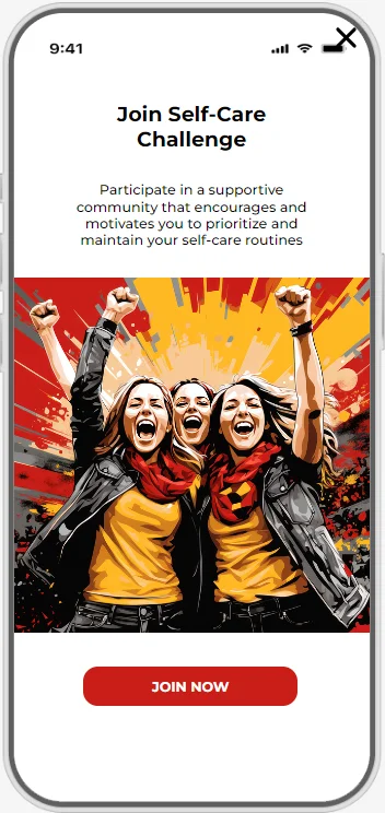
Key Features Announcement
Clear, visually appealing, and informative messages improve user understanding and satisfaction with crucial features. They can explore new features without leaving the app, providing a seamless experience.
Tips
- Highlight Benefits: Focus on how the new feature will improve the user experience or solve a problem.
- Use Visuals: Include images or GIFs to make the announcement more engaging and easily understood.
- Provide Guidance: Offer a quick tutorial or link to a help guide so users know how to use the new feature.
- Target Your Audience: Segment users and tailor feature announcements to relevant audiences, making the messages more impactful.
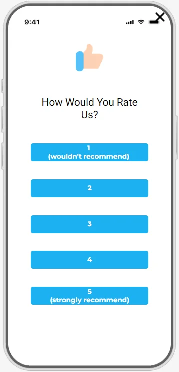
NPS
In-app NPS surveys are highly effective in capturing user feedback due to their convenience and visibility. NPS identifies promoters, passives, and detractors, enabling targeted improvements and personalized follow-ups.
Tips
- Segment Responses: Use different thank-you links for each response and segment users according to their choice. Analyze responses based on user segments to identify specific areas for improvement or success.
- Optimal Timing: To capture relevant feedback, trigger NPS surveys at appropriate moments, such as after a significant interaction or milestone.
- Follow-Up Questions: Include an optional follow-up question to gather more detailed feedback on why the user gave their score.
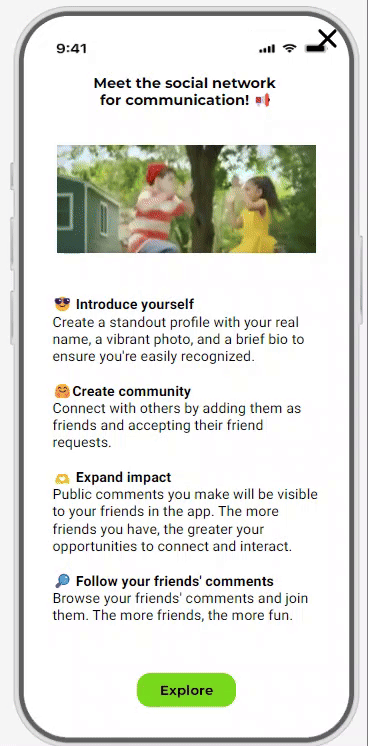
Designing In-App
In the second part of this article, you’ll see how easy it is to create engaging In-App messages in Reteno's drag-and-drop editor.
Let’s create the In-App with the announcement about a new social network for communication.
Creating the message
-
Double-click the default image and download your file instead of it.
-
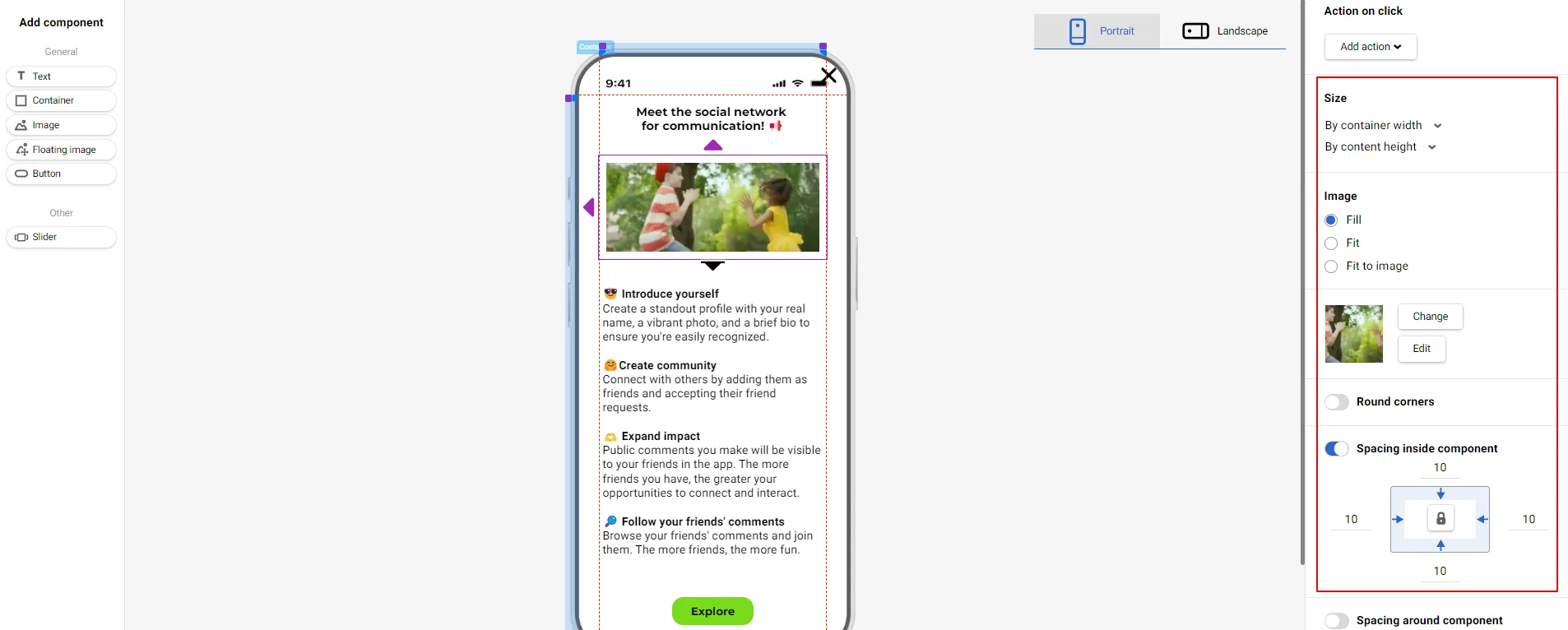
Configure the GIF settings:
- Size — by container width and content height.
- Image — fill.
- Spacing inside component — all together, 10.
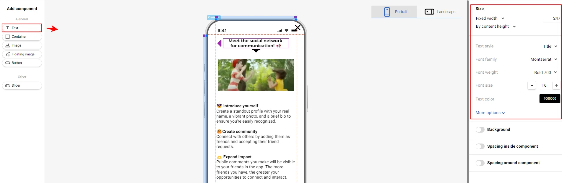
- Add the Text block above the GIF:
- Size — fixed width (247), by content height.
- Text style — Title.
- Font family — Montserrat.
- Font weight — Bold 700.
- Font size — 16.
- Text color —
#000000. - Text align — center.
- Line spacing — normal.
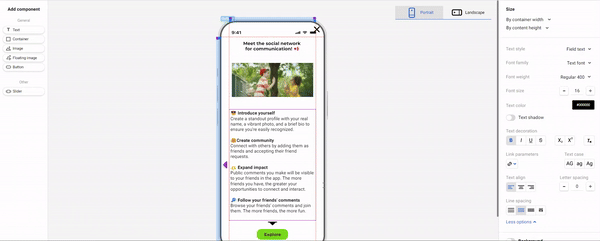
- Add the Text block under the GIF:
- Size — by content width and container height.
- Text style — Field text.
- Font family — Text font.
- Font weight — Regular 400.
- Font size — 16.
- Text color —
#000000. - Text align — left.
- Line spacing — normal.
- Spacing inside component — all together, 5.
- Spacing around component — individually, 10 (left and right), 3 (top), 0 (bottom).
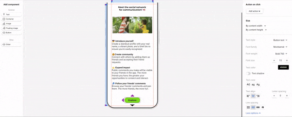
- Configure button settings:
- Select action on click
- Size — by content width and container height.
- Text style — Button text.
- Font family — Montserrat.
- Font weight — Bold 700.
- Font size — 15.
- Text color —
#000000. - Text align — center.
- Line spacing — normal.
- Background color —
#79DB1D. - Round corners — all together, 15.
- Hover effects — on.
- Background color — `#F1DF1C``.
- Spacing inside component — in pairs, 25 (left and right), 10 (top and bottom).
- Spacing around component — individually, 10 (bottom), 0 (left, right and top).
-
Configure the Close icon settings:
- Select icon type.
- Color —` #000000``
- Size — 25.
- Position — (-)45 (X), (-)50 (Y).
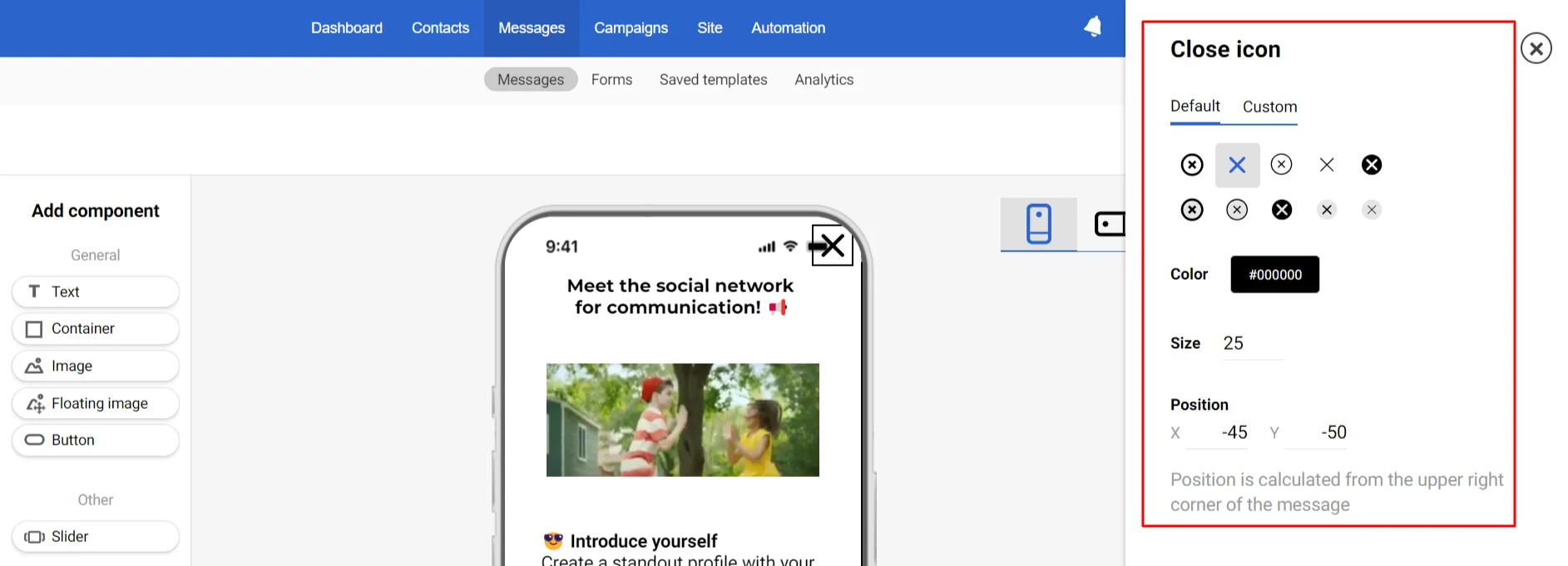
NoteWhen designing a message, pay attention to the top block with indicators — it depends on the devices, so it’s better not to place important design components there.
-
Click In-App background to configure common message settings:
- Select action on click.
- Distance between elements — 30.
- Background color —
#FFFFFF. - Spacing inside component — individually, 27 (left and right), 52 (top), 10 (bottom).
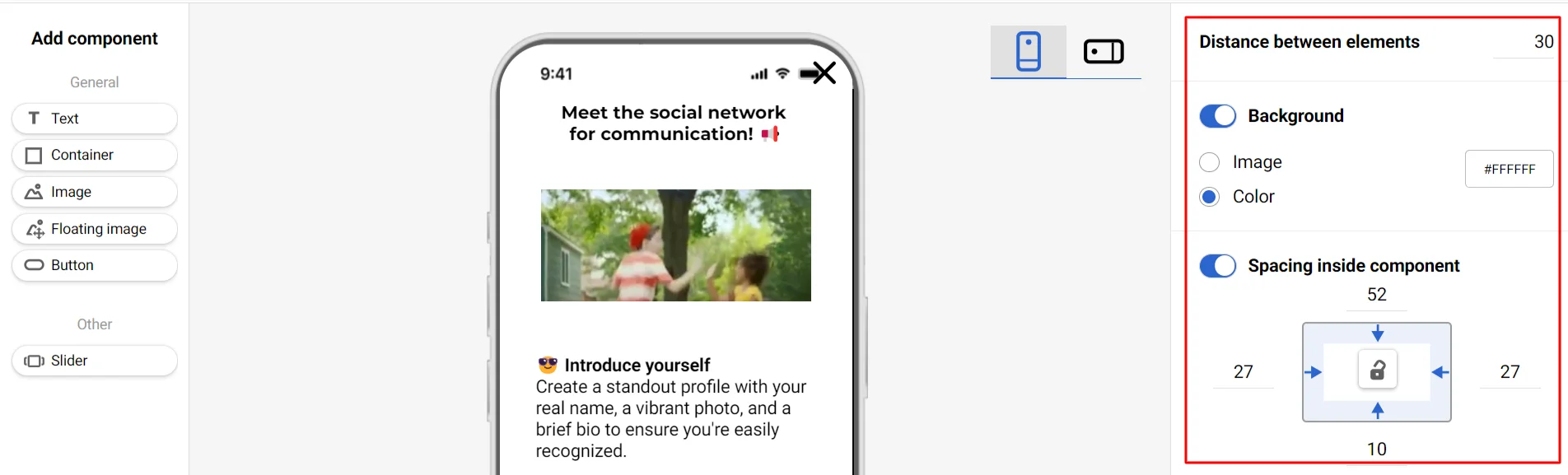
NoteUse the Container component for complex structures — when turned over, the container's structure will remain unchanged.
As you can see, despite its simplicity, the In-App editor allows you to create attractive messages that will help improve your app users' engagement and retention.
For more information about the editor, please see the manual by the link.
Need more ideas on In-App campaigns? Check 7 In-App Campaign Best Practices.