
Best Practices for Email Template Design and Structure for Health & Fitness Mobile Apps
Email marketing is an invaluable tool for health & fitness mobile apps, helping to boost engagement, retention, and user satisfaction. An ideal email template should be well-organized, aesthetically aligned with the brand, and responsive to users’ devices and needs. Here’s a guide to creating email templates that appeal to users and keep them motivated on their journey to health.
1. Clean and Simple Design
- Embrace Minimalism: Use a minimalistic layout that aligns with a sense of focus and motivation. Fitness journeys often rely on clarity, and an uncluttered design reflects this by ensuring the message stands out.
- Choose Brand Colors Thoughtfully: Select a soft yet energetic color from your brand palette. Colors can evoke calm or excitement, so choose hues that align with the app's purpose and user emotions.
- Create Clear Sections with White Space: Separate each section with adequate white space to reduce visual clutter. Sections for new workouts, motivational quotes, or recent progress should have defined space so users can easily absorb each message.
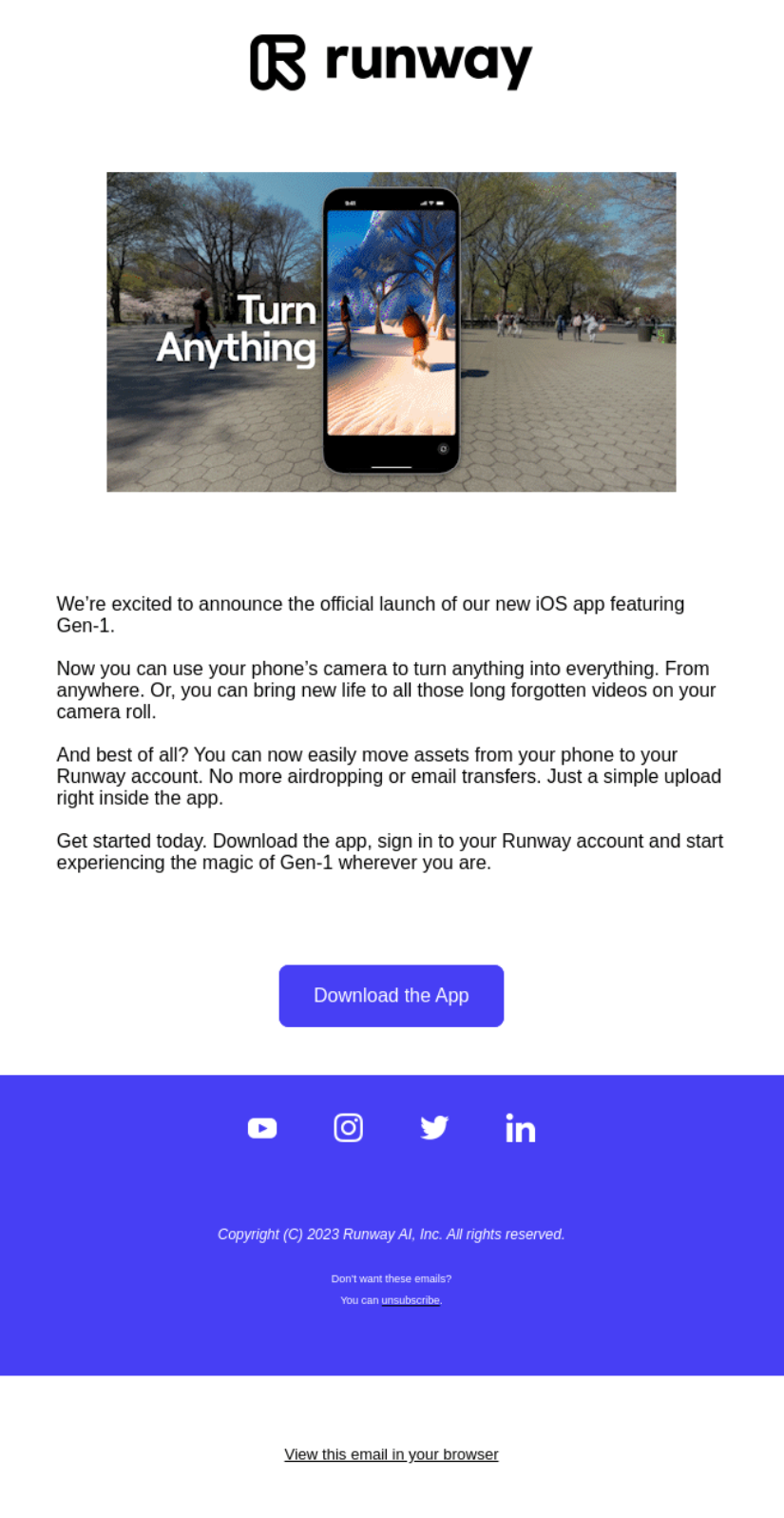
2. Responsive Design
- Optimize for Mobile Users: Over half of email opens happen on mobile devices, so a mobile-friendly template is essential. This means larger buttons, clear font sizes, and minimal scrolling.
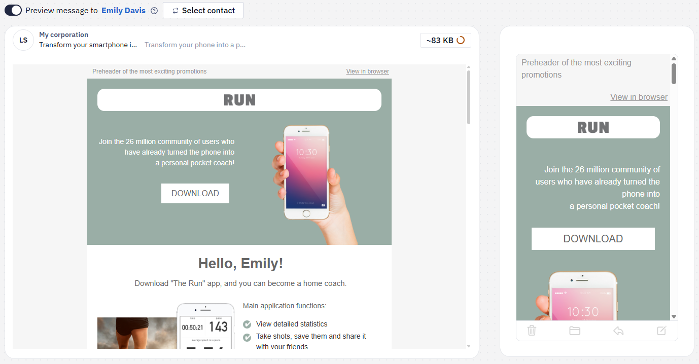
- Test Across Platforms: Test your email templates on popular email clients (like Gmail, Apple Mail, and Outlook) and on multiple devices. This helps identify any design inconsistencies.
- One-Column Layout for Mobile Readability: Stick to one-column layouts to make the template easier to read on smaller screens.
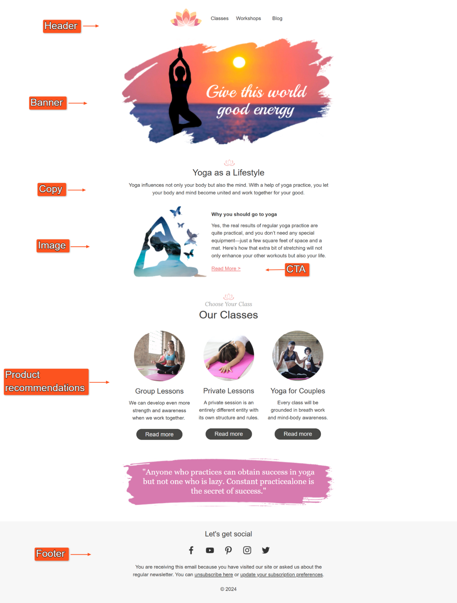
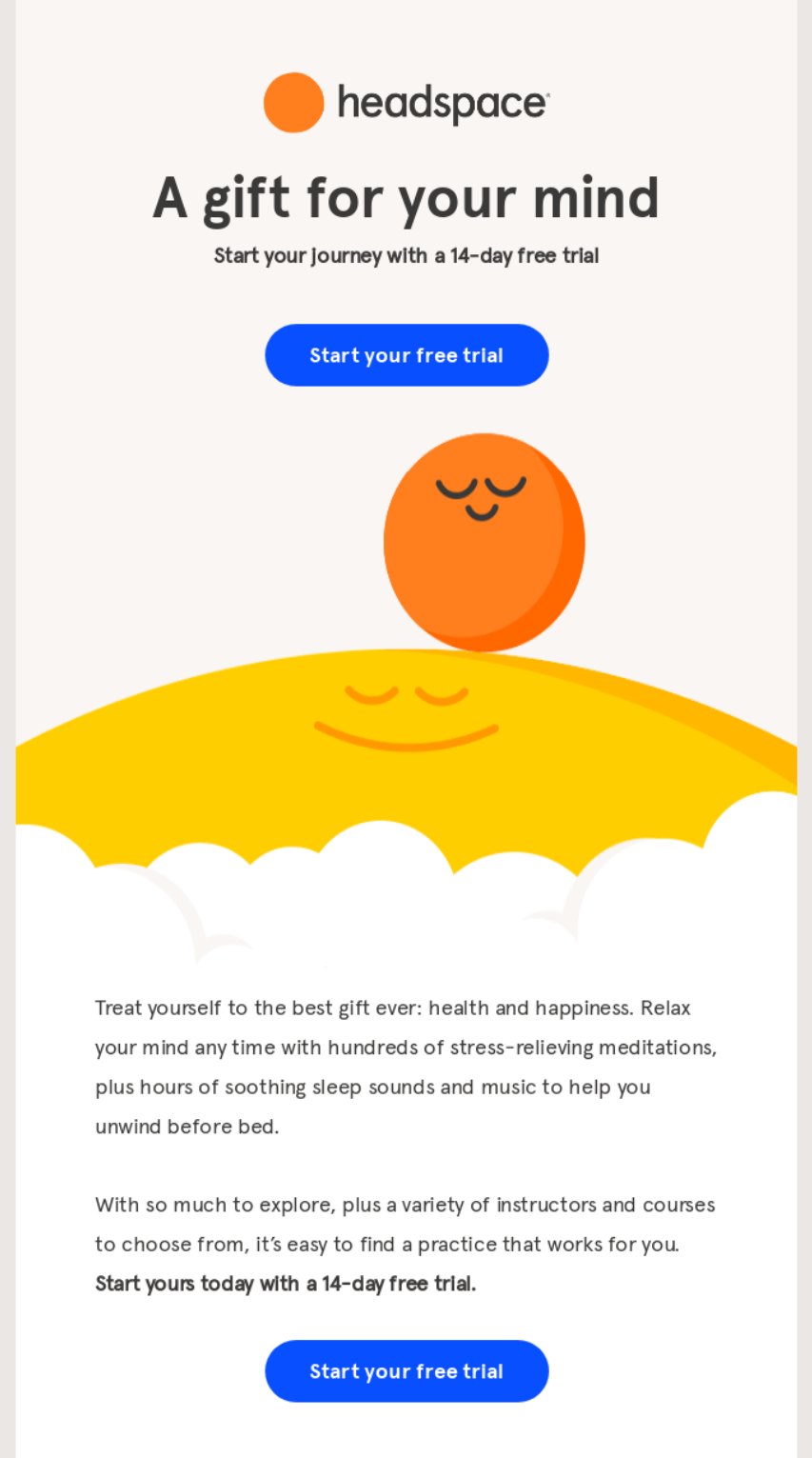
- Follow the Typical Email Structure: Maintain the classic email flow, which typically includes a header, an engaging image or banner, the main body with valuable content, a clear CTA, and a footer. This structure helps users quickly find essential information and engage with the email.
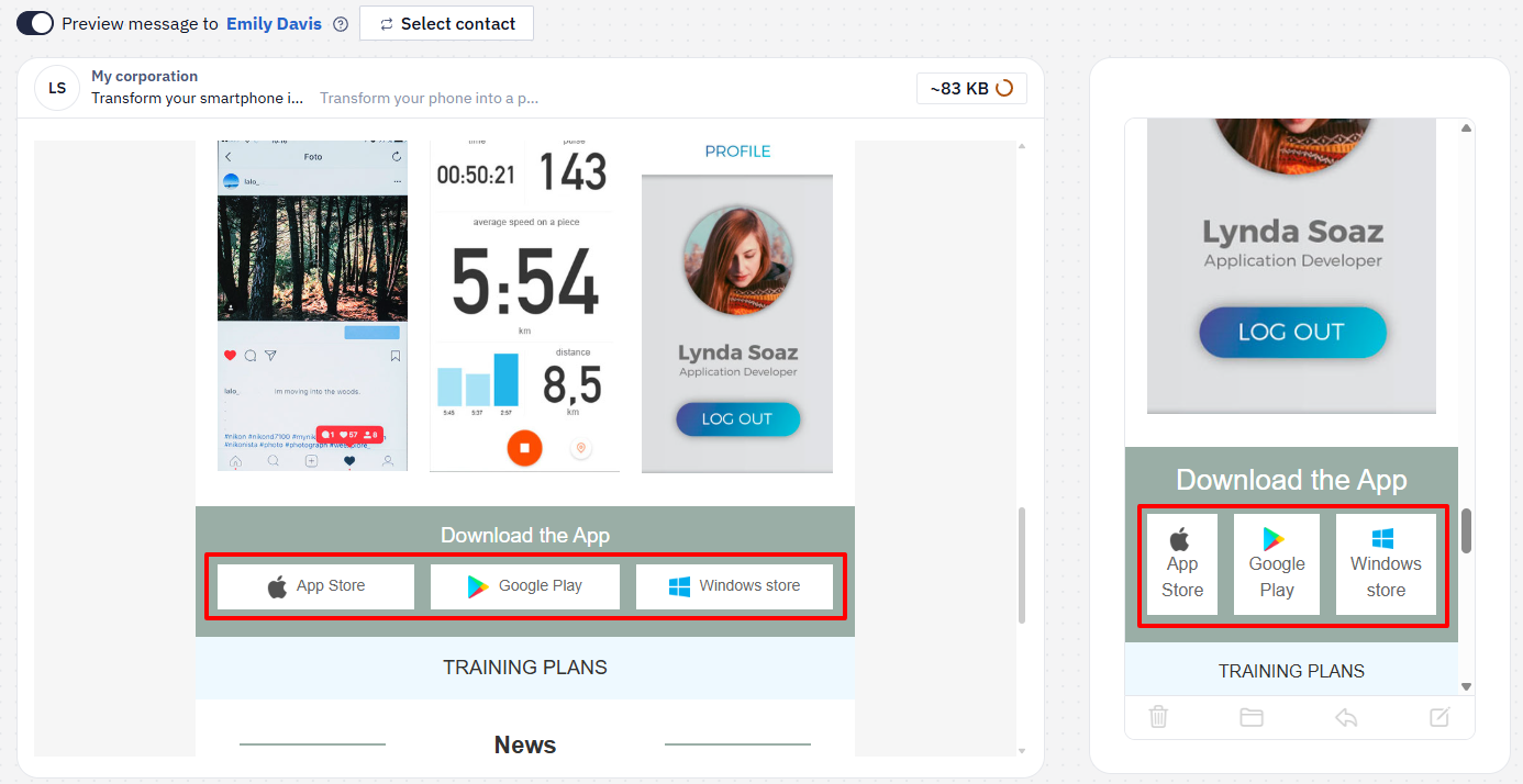
- Optimize Element Display for Different Devices: Hide or rearrange certain elements based on the device type. For example, you might offer app download options differently on desktop and mobile.
More on Responsive Email Editor >
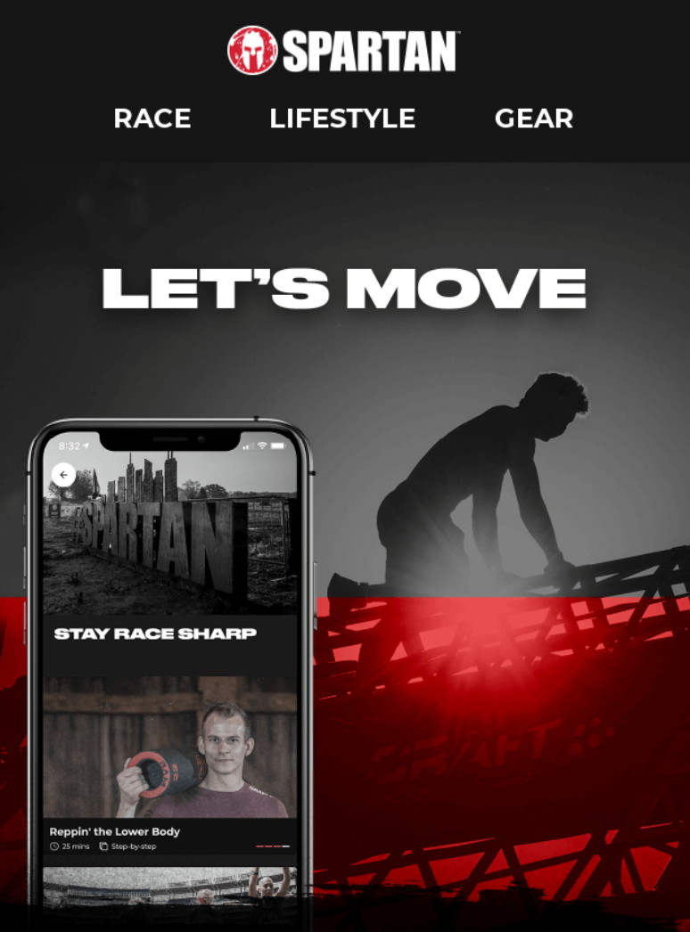
3. Header
- Include App Branding: The header should feature your app’s logo for easy recognition and brand consistency.
- Craft an Inviting Headline: Use a motivational headline like “Stay Strong with Us” or “New Challenges Await.” This first line sets a welcoming tone for the content that follows.
- Navigation Bar for Quick Access: If you offer direct links to sections in your app or website (like “New Workouts,” “Community,” or “Profile”), a navigation bar under the header can improve accessibility and engagement.
4. Pictures
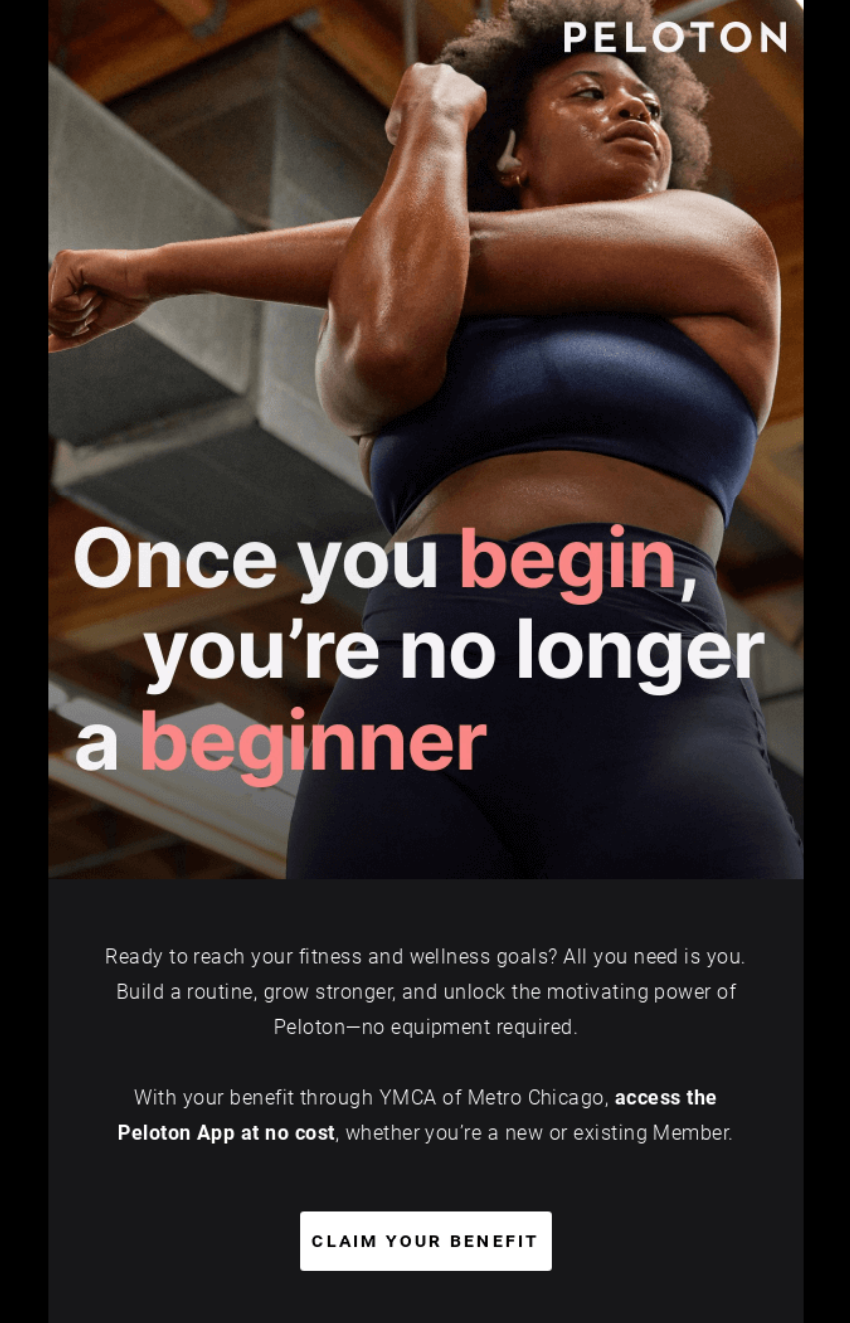
- Engaging Banners First: Use a responsive banner just below the header to grab attention, ideally around 640x480 pixels for optimal display. This banner could highlight new features, upcoming challenges, or a motivational image. Ensure it’s visually appealing but doesn’t overwhelm the email.
- High-Quality, Lightweight Images: Choose high-resolution images that are optimized for fast loading. This keeps the email visually appealing without slowing down performance.
- Include Alt Text for Accessibility: Always add alt text for images to improve accessibility and provide context if images don’t load. Ensure the images resize well on different devices to keep the design looking polished across screens.
5. Typography and Text
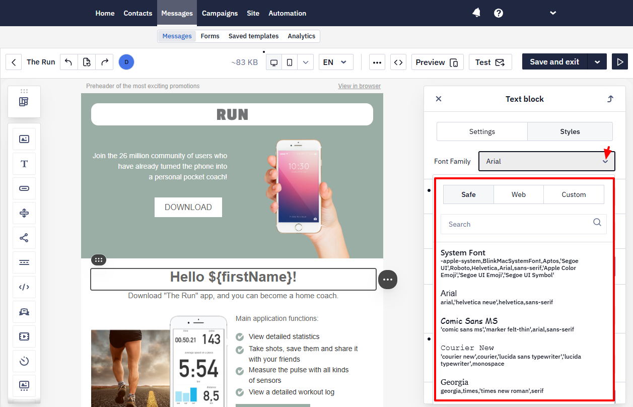
- Select Legible Fonts: Use standard fonts like Arial, Helvetica, or other sans-serif options to ensure readability across all devices. If you choose custom fonts, be aware that not all email clients support them and might substitute standard fonts instead.
- Readable Font Sizes: Use 14-16pt for body text and 22-24pt for headers to ensure readability on both mobile and desktop.
- Consistent Font Hierarchy: Maintain a clear hierarchy in fonts for headers, subheadings, and body text to organize information effectively.
- Text Block Height: Keep text blocks between 500-600 pixels high to prevent the design from feeling cluttered and ensure a digestible reading experience.
- Clear, Concise Text Blocks: Keep the text concise and ensure each message is easy to scan. Short, motivational phrases are more effective than dense text.
- White Space for Ease of Reading: Separate lines and paragraphs with white space to make the email feel spacious and easy to read.
6. Call-to-Action (CTA)
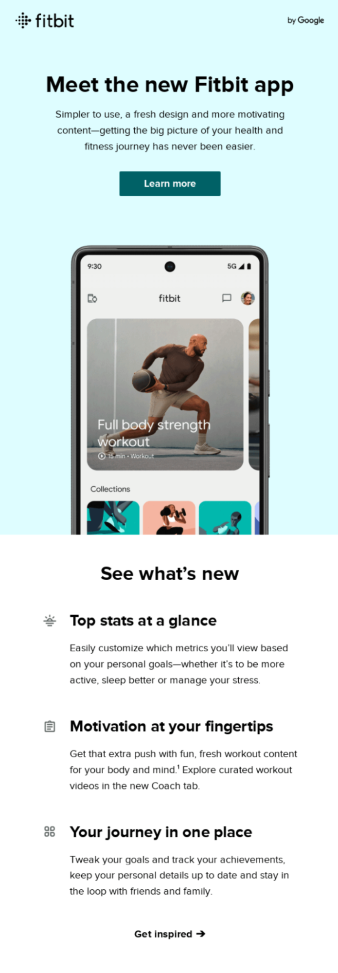
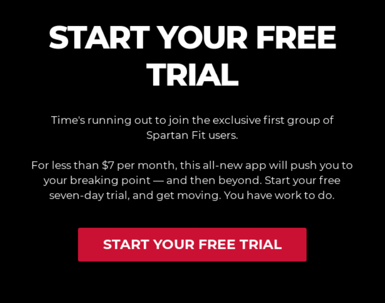
- Create Clear and Motivational CTAs: Use CTAs that guide users, such as “Try Today’s Workout,” “Start Now,” or “View Progress.” They should be action-oriented and focused on the user’s next steps.
- Soothing Button Style: Choose rounded button edges to match the app's aesthetic and create a calm, friendly appearance.
- Standout Colors for CTA Buttons: Select a contrasting color for CTA buttons to make them noticeable while still blending with the overall email theme.
7. Personalized Content Blocks
- Dynamic, Relevant Suggestions: Include workout recommendations or goals based on the user’s recent activity. For example, if a user completes a yoga workout, you might suggest another yoga session or meditation.
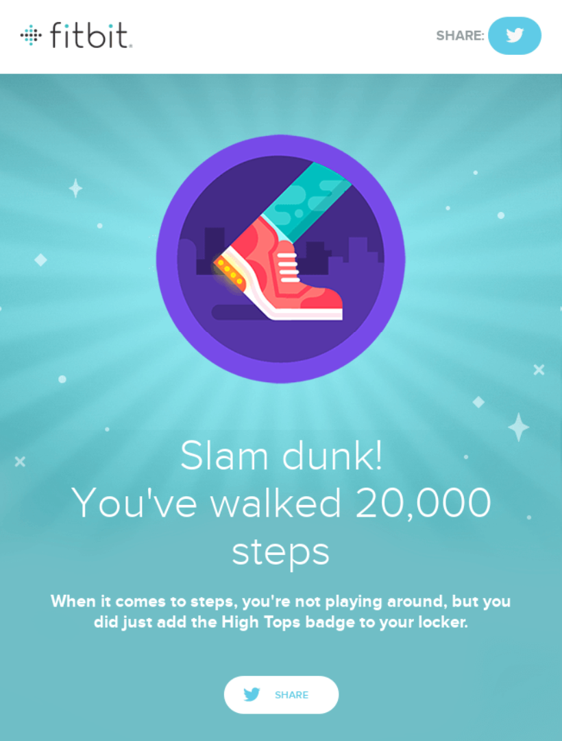
- Progress Updates and Achievements: Celebrate users’ accomplishments, such as “You’ve completed 3 workouts this week!” These progress updates reinforce positive behavior and build loyalty.
8. Footer
- Contact Information and Unsubscribe Links: Make it easy for users to reach you or unsubscribe. A simple, clean footer that includes these links respects user autonomy.
- Social Media Icons: Include icons for your social media pages, like Instagram or YouTube, in a subtle way that doesn’t distract from the main message.
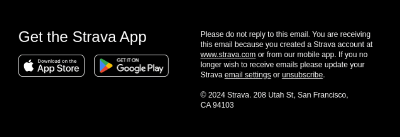
- App Store Links: Include links to download the app from the Apple App Store and Google Play Store. This is a great way to nudge users who may be viewing the email on a desktop to easily download the app to their mobile device.
- Minimal and Consistent with Brand Aesthetic: Use soft colors and concise wording to keep the footer clean and aligned with the overall email theme.
9. Balance of Text and Imagery
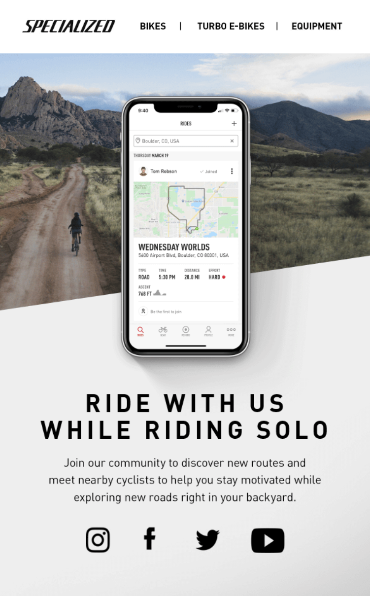
- Avoid Overloading Users: Use a balanced mix of text and images to prevent the email from feeling too busy. Each section should have a purpose, and the visual elements should complement the text.
- Soothing, On-Brand Imagery: Use visuals that enhance the email’s message, such as serene landscape images or light animations that reflect the app’s themes of calm and focus.
- Subtle GIFs for Animation: For a touch of animation, you can use GIFs, like a breathing exercise, to create a calm, dynamic effect without distraction.
10. Accessibility
- Use High-Contrast Colors: Select colors that create strong contrast for readability. The text should stand out against the background without strain.
- Descriptive Text Links for Screen Readers: Ensure text links have descriptive language, like “Get Started on Your Journey,” to help screen readers navigate the email easily.
- Optimize for Users with Disabilities: Provide ample white space, avoid flashing images, and use simple navigation to make your emails accessible to a wider audience.
Following these best practices will ensure your Health & Fitness app’s emails are designed to engage and support users, making them a valuable touchpoint in each user’s journey. By using clean layouts, personalized touches, and accessible designs, you create an email experience that enhances both user motivation and satisfaction.
NoteExplore our guide on creating broadcast email newsletters for fitness mobile apps
Updated 3 months ago