
Accessibility Checker in the Email Editor
Some recipients rely on assistive technologies, such as screen readers, that read out message content or convert it to Braille. Without alt text, sufficient color contrast, or correct HTML structure, these recipients may find your email hard to perceive. Accessibility matters most for people with visual impairments or cognitive disabilities.
The accessibility checker scans your email and finds elements that might be difficult for such recipients to interact with. For each issue found, it suggests a way to fix it and helps make the email more accessible.
NoteThe checker is available in the drag-and-drop email editor and on the email preview screen.
What the Checker Reviews
The accessibility checker covers the following areas:
- Alt text for images
- Color contrast
- Link and button labels
- Headings (the
titleelement, the first-level heading, and others) - Language and text-direction attributes (
lang,dir) - Text alignment
- HTML/ARIA structure
Running the Checker
- Open your email in the editor or on the preview screen.
- Click the arrow next to the Test button.
- Select Run accessibility test.
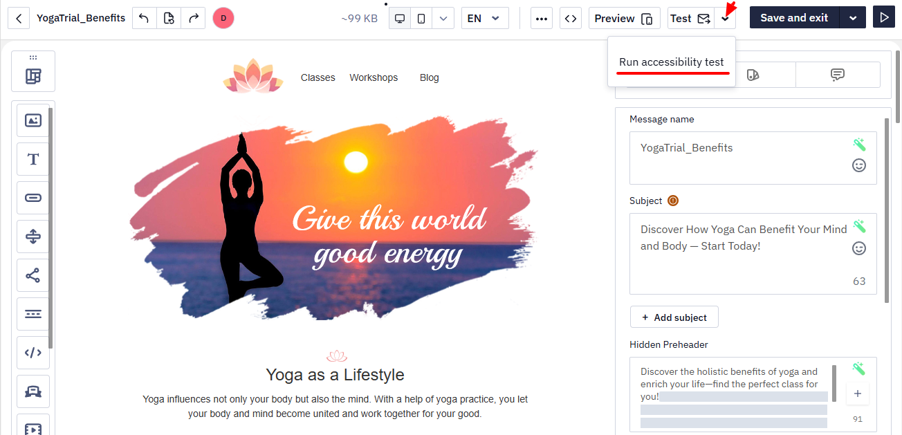
The Accessibility checker panel opens on the left and starts scanning the email. This can take a few seconds.
Reviewing the Results
Once the scan is complete, the panel groups the results into three tabs:
- Failed — issues that need attention
- Passed — checks the email already meets
- Ignored — issues you chose to skip
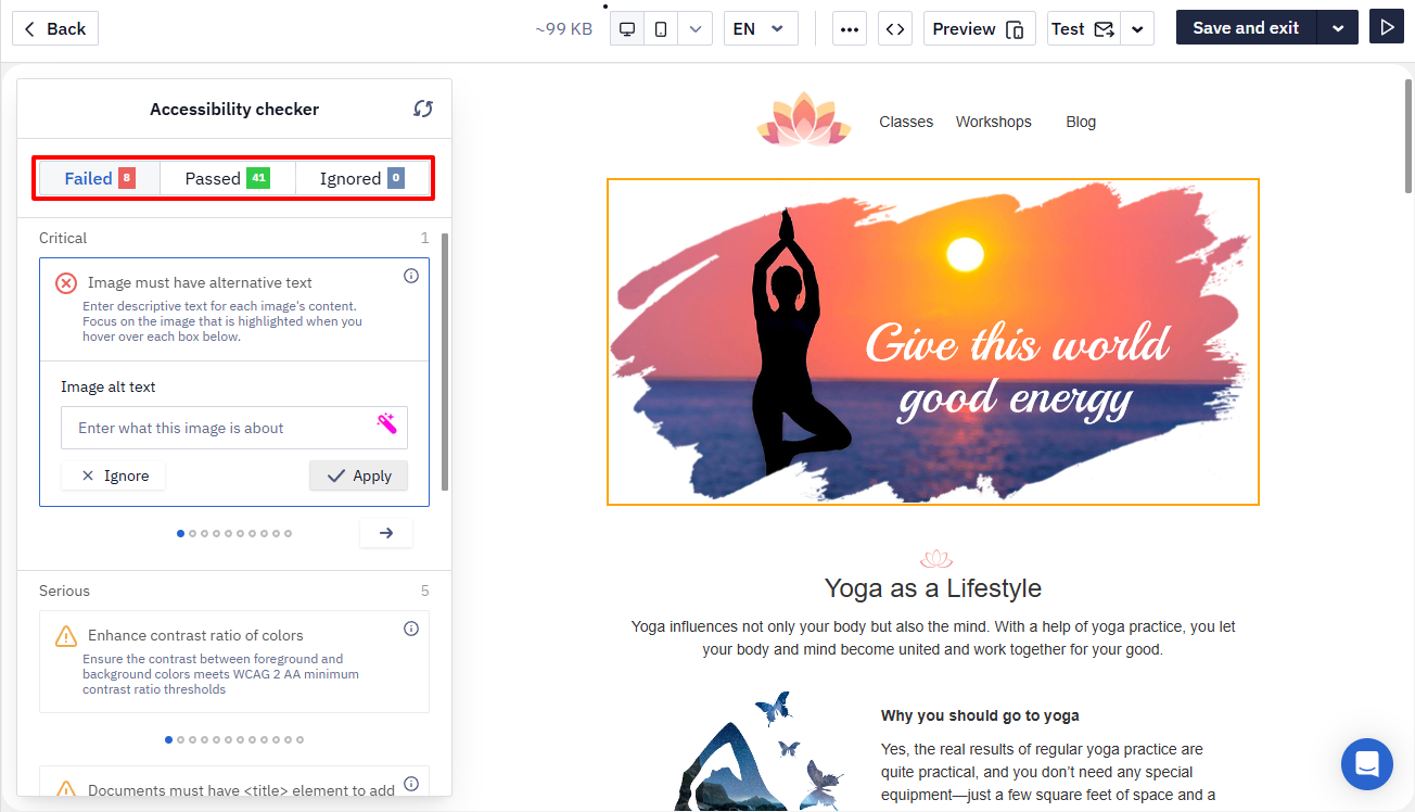
Issues in the Failed tab are grouped by severity: Critical, Serious, Moderate, and Mild.
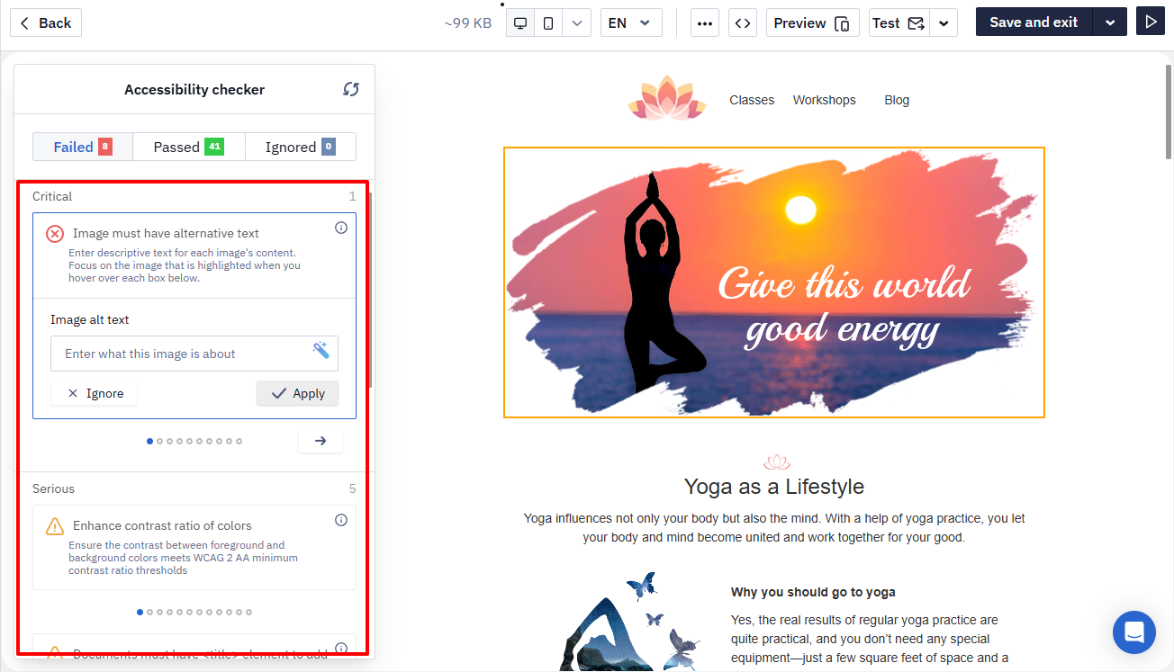
Each card shows a short issue title and a brief description of the rule.
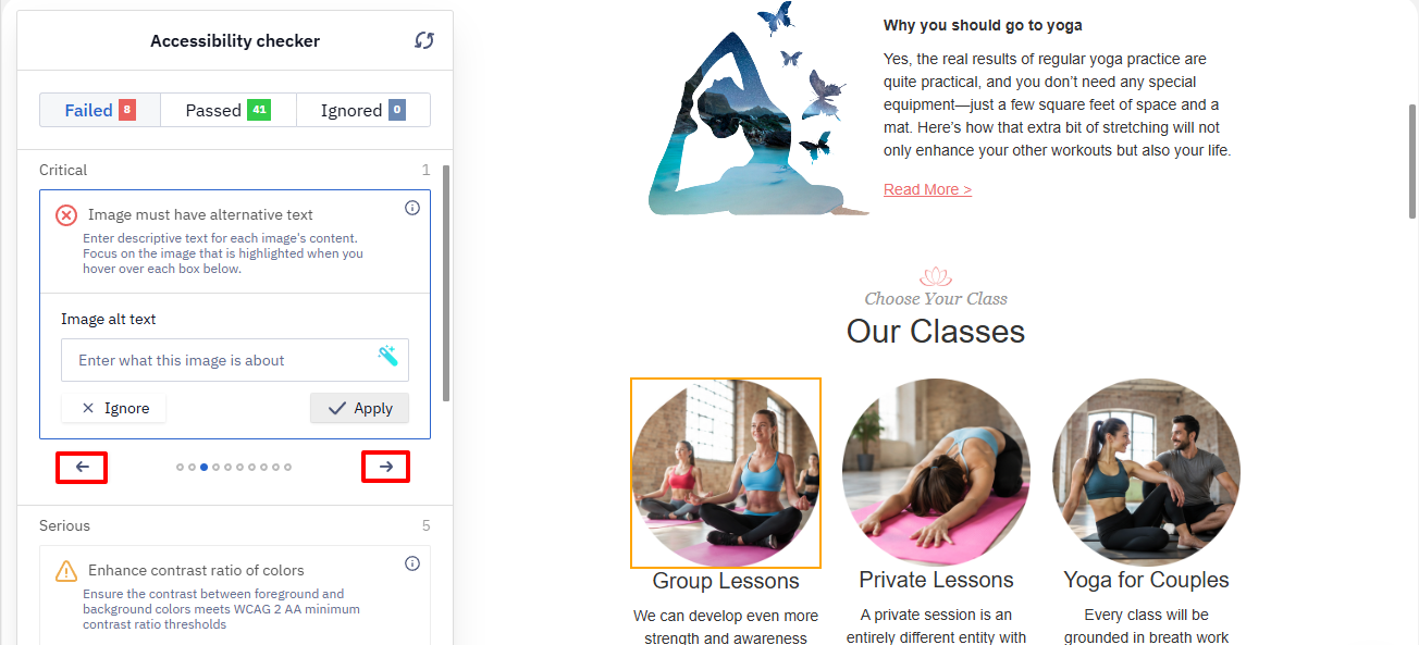
Use the ← and → arrows at the bottom of the panel to move between issues within a group.
Click the i icon on a card to expand it and see the fix options. Hovering over the icon shows a tooltip with a link to the ACT Rules Community Group forum, where you can learn more about the issue.
Fixing Issues
The expanded card looks different depending on the type of issue. Below are a few examples.
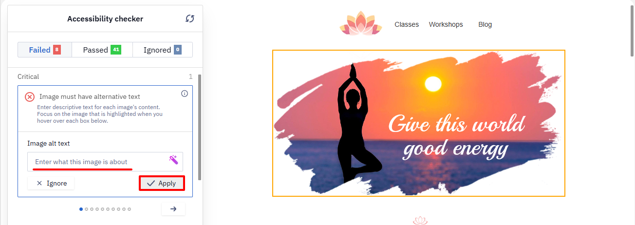
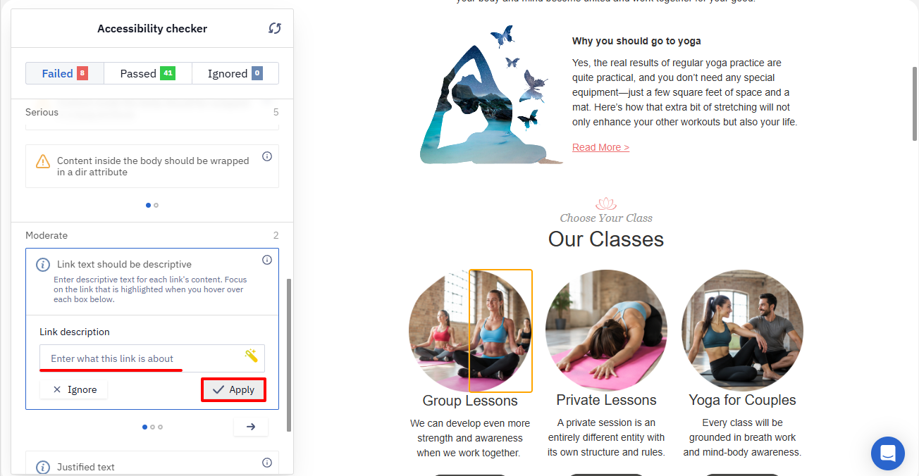
If an issue requires text that's missing — for example, an image alt text or a link description — the card shows an input field. Enter the text and click Apply, or click Ignore (✕) to skip the issue.
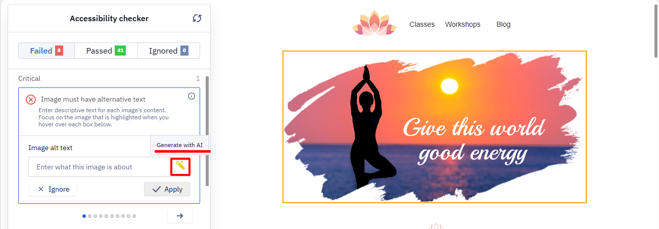
For image alt text, you can also click Generate with AI — the service suggests a description based on the image itself, which you can then edit before applying.
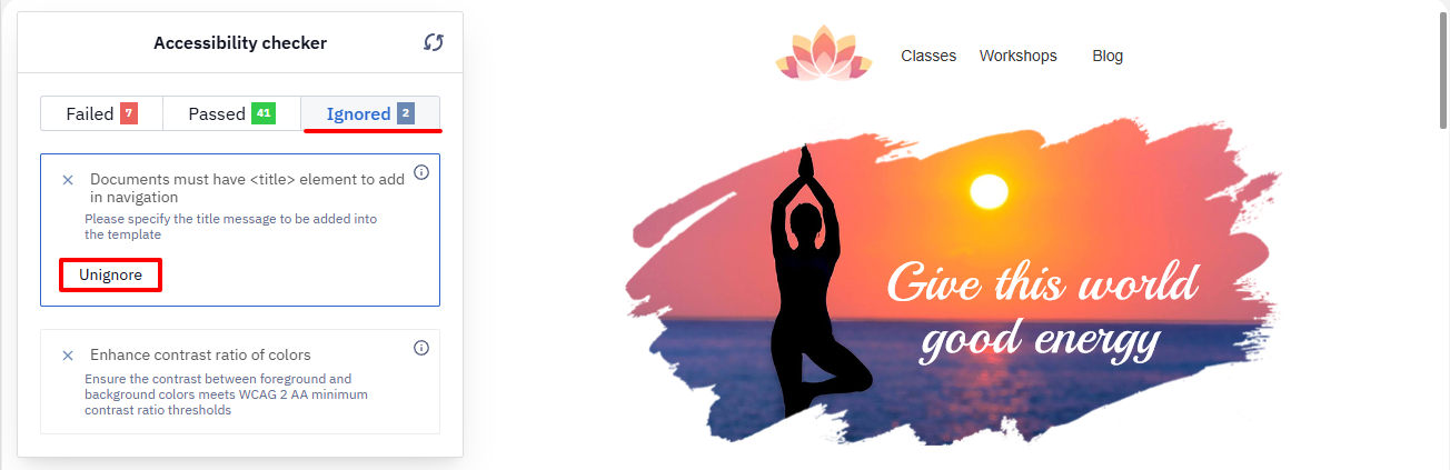
To bring an ignored issue back to the Failed tab, open the Ignored tab and click Unignore on its card.
Link description issues work the same way.
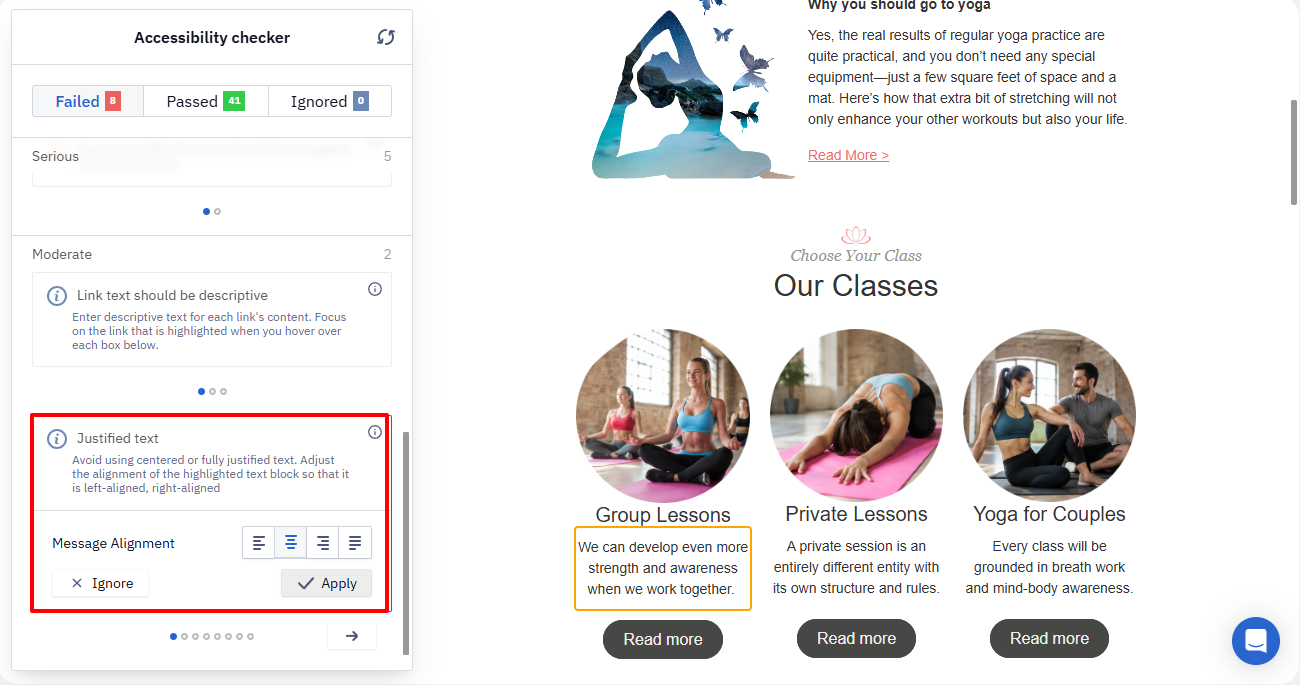
For text alignment issues, the card lets you choose an alignment option — left, center, right, or justified — from ready-made buttons.
Use left alignment for body text. Justified alignment creates uneven spacing between words and can make text harder to read.
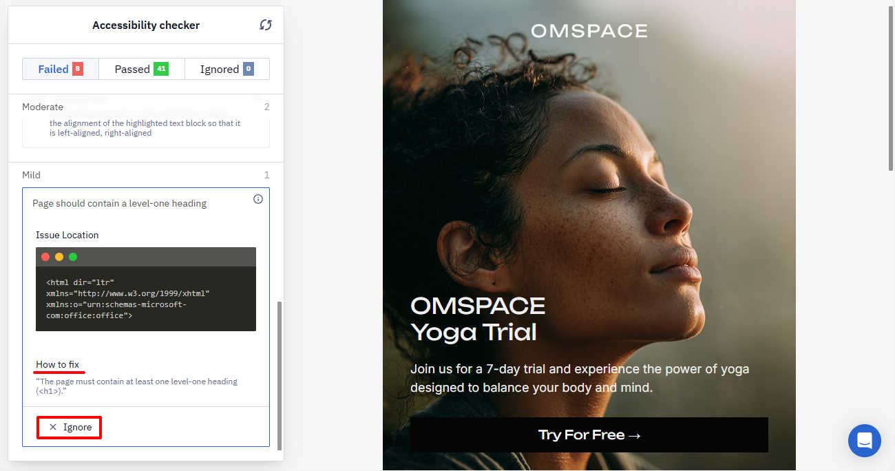
If an issue can't be fixed directly from the panel — for example, a missing level-one heading in the template — the card shows an Issue Location section with the relevant code snippet and a How to fix section describing what to change in the template. In this case, only the Ignore button is available.
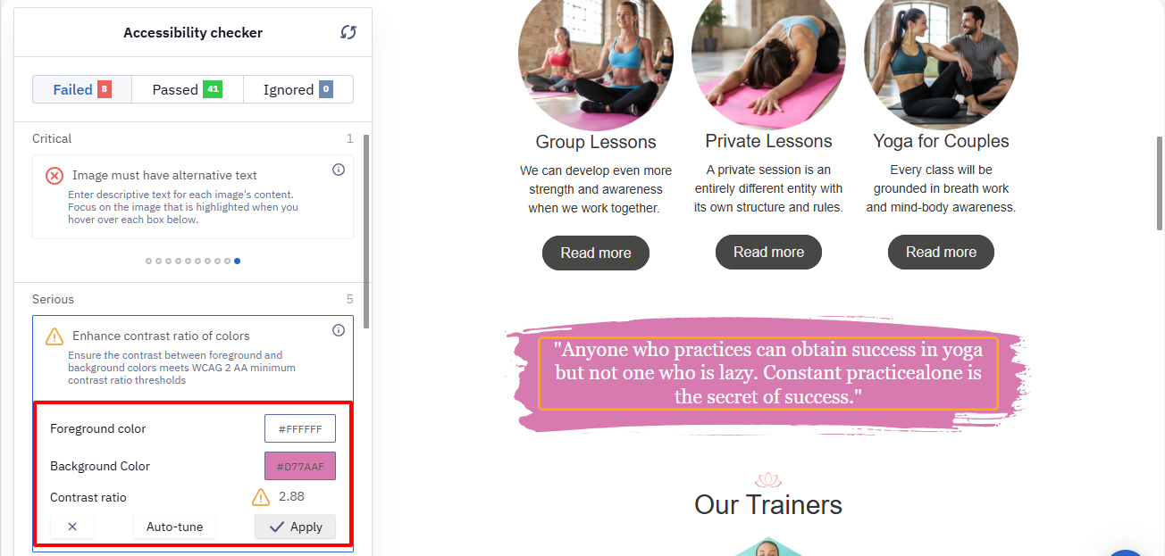
For color contrast issues, the description explains that the contrast between the foreground and background colors must meet the minimum WCAG 2 AA requirements. Edit either color yourself, click Auto-tune to let the checker pick a compliant color automatically, and then click Apply — or click Ignore to skip the issue.
NoteThis isn't an exhaustive list. For other rules, the expanded card may show other controls specific to that issue.
Click the refresh icon in the panel header to re-run the checker after making changes.
Before Sending
After fixing the issues, check that:
- key information — offer terms, dates, and calls to action — is presented as text, not only in images;
- important images have clear alt text;
- links and buttons have informative labels;
- text and background contrast meets the minimum WCAG 2 AA requirements;
- color isn't the only way you convey meaning — important distinctions are also explained in text or labels;
- the email has correct headings and language attributes;
- you've re-run the accessibility checker after making changes.
Updated 3 days ago